Using two allocated words coarse and wet we had to collect visual representations of the textures described. What textures can you find which don't adhere to the stereotypes of London in a new light? From this we had to create a concertina booklet which gives an insight into unseens London's textures.
Working in pairs we had to use the 2 textures to represent London in a non-stereotypical way. You must not use the obvious but think further into how the texture can be represented visually in this format. So we headed out of the uni to get some photos.
This lady was having a very large animated rant to a friend but the way that she spoke was typical of London, to the point, no sugar coating and so we thought it represented the word coarse. So we asked her to carry on talking whilst I took photos.
This guy, by doing a sad face, thought represented the word wet not in the physicality but by the personality of being wet.
Looking more at the physicality of the word coarse I took photographs of the smashed glass as I thought it represented the personality of some people in London.
To follow the word wet I wanted to photographs things that were physically wet but that you wouldn't usually want to talk about, for example sweat of spit on the floor.
I found this rough door to the gym next to my uni again I felt it was looking at the physicality of the word coarse.
After uploading our groups photographs I quickly roughly edited them (they all had to be black and white)
To break up the colours of black and white and the textures in the concertina booklet we printed on different coloured paper and cards which I think broke it up well.
 |
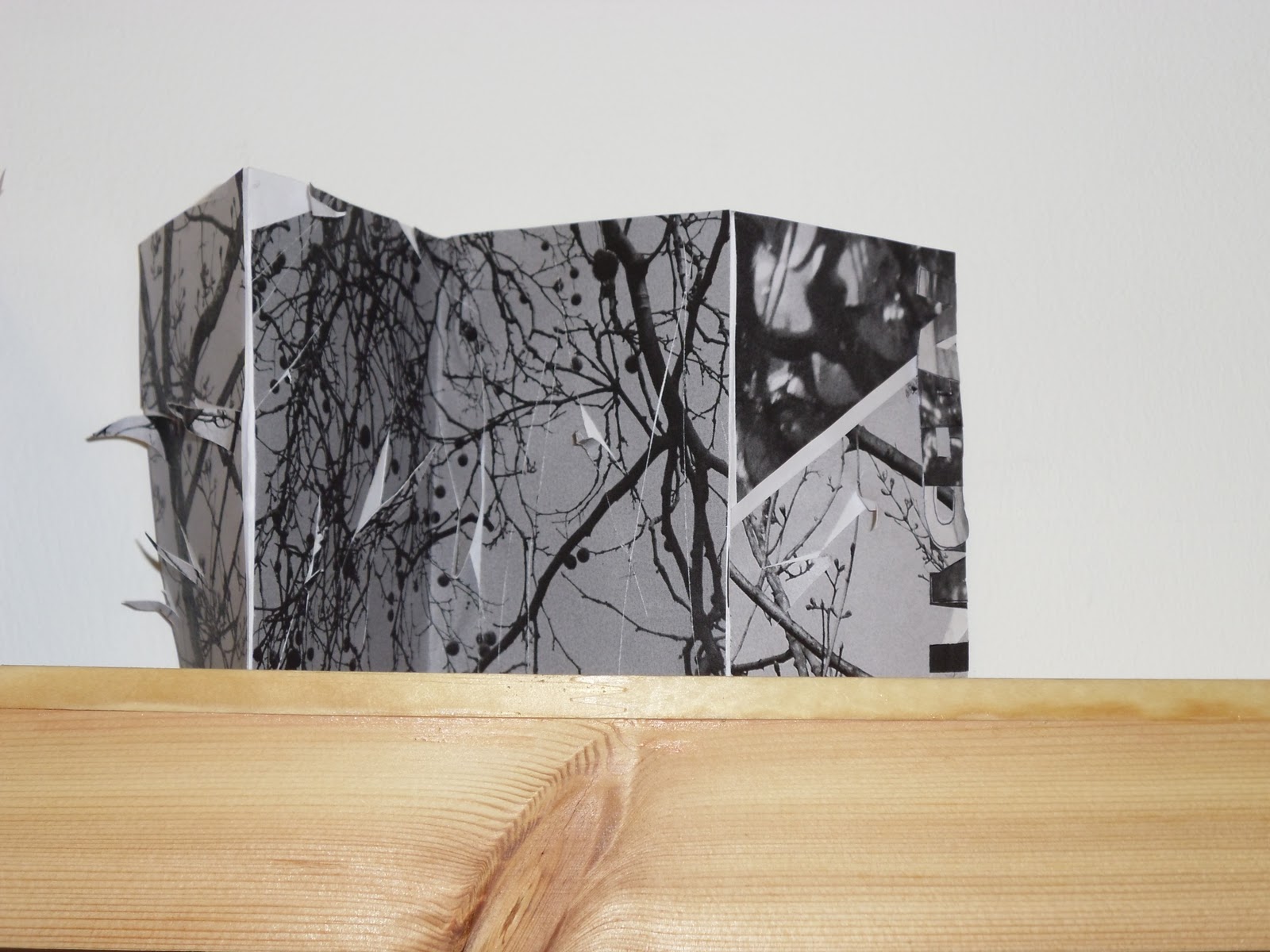
| Finished concertina booklet |
 |
| Back |
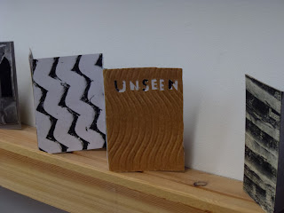 |
| Examples of other peoples work |