Workshop Outline
Using typography you will be developing the use of emphasis within a London poem or song, which you will be provided. You will be exploring the use space, size and weight within a set shape.
Using various combinations you will create a number of visual representations each with a different meaning.
Brief
To design 5 CD covers to one of the London songs providedusing a purely typographical representation of a verse or chorus. Put emphasis into your typography using size, space and scale.
Constraints
Document size 150mm X 150mm
Use the provided text
Use a maximum of 2 typefaces
Do not use any digital methods to layout the type
Goals
To learn and practise the skill of using emphasis with typography
To create a visually appealing artwork
To practise working within constraints
We were given the lyrics and titles to the song LDN by Lily Allen and Streets of London by Ralph McTell in various typefaces and sizes.
I had to look at the lyrics and see which words best summed up the song or were the most eye catching.
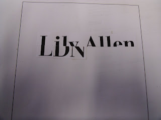
I cut the words Lily Allen and merged it with the title LDN to see if it works, I think it would work better if I could do it on the computer and manipulate the words and line them up.


No comments:
Post a Comment