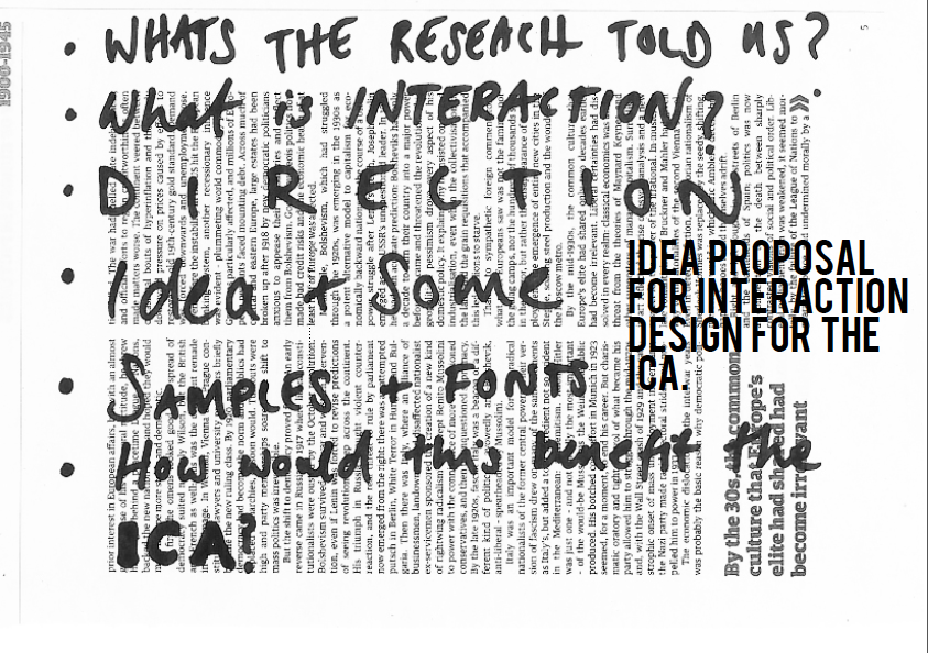
On Monday we had the ICA final presentation with some really strong ideas shown. Though surprisingly most people went with the similar idea of influencing the audience to send in their message- mine was through postcards and others through a text based projection or a website which shows live twitter feeds.

Sarah's response to my work was very positive and her ideas were really beneficial and helpful:
-Look more into the idea of community with ICA and base the questions on the postcards with the brand: for example a secret about the ICA or a fact about artists who worked there.
-Look at the simplicity of postcard design, she liked how simple it was but wanted it to be simplified further.
-The postcards could have a few different questions that are turned around every few months.
-The presentation is strong and research strong there were some example case studies that she was surprised that I had used and shows that I researched the topic in depth.
There were some really good projects and so it was really useful to watch everyone else presentations and work to see how they had come to that conclusion. Especially Toby, Daniel and Nic's project. They worked in a group and designed a website, a blog and promotional material, which was really strong ( though they are in 2nd year so they have to be better!)
This is some screenshots of there case studies:


They looked at the barbicans promotional material which is a tear off press release pad. It is bolted to the wall and provides a good solution to a messy pile of paper. It featured heavily in their response for the ICA.

This is their home page to the website. The whole idea is that it is supposed to represent tipping out a box of memories out on the table and hunting through. I love the concept of the website, its title being INCOMPLETE ARCHIVE, however, for me, it would really irritate me having moveable icons especially with the count down timer in the background as it would feel there is too much happening at one time. Also through my research in the project many people were confused about the identity of the ICA and I think to have such an overcomplicated website does not really help their cause. But at the same time it is such a great concept...maybe just not fitting to the brief.

Font try outs for their Incomplete Archive Web Page title.

Very similar to the barbican's promotional material their design, (with the same overlapping theme from their webpage) is designed to tear off from the wall and again in half and again into quarters with information about events going on at the ICA


I felt that simplicity in this project is key to engaging a wider audience, and so any promotional material or website needs to be clear cut and easy to navigate through.
Matt Bolton's Project did not score to highly however I felt that it was a really strong project:


The idea is to have a part in the ICA which has moveable magnetic words stuck to it such with the title...THE ICA is...and the audience is invited to share their response on the fridge.


Some of Paola's research showed some really interesting facts and figures:
Visitors and audience tend to remember:
10% of what they have read
20% of what they have seen
50% of what they have heard
90% of what they do.
Visitors are driven by:
Spiritual 3%
Emotional 11%
Intellectual 39%
Social 48%
Sometimes really brilliant ideas and strong concepts are lost by the lack of organisation and presentation skills, especially when some people had work all over the place. This is something I tried to work on after the Newspaper project presentation which I felt really unprepared for and luckily it paid of this time, and made me realise how important it is.
No comments:
Post a Comment